
Moving Image Museum
Keyword:
Brand Identity
Brand Identity
Year:
2020
2020
Moving Image Museum exists to expand public understanding and appreciation of the art, history, technique
and technology of film, television, and digital media by
collecting, preserving, and providing access to moving-im-
age related artifacts via multimedia exhibitions and
educational programming.
With the development of our brand, we feel the need to update the existing style. We did many works to keep the brand recognizable, but add a new perspective.
Our unique identity, fresh systems and stationery create a distinct framework for our brand which helps us to stands out from art world.
With the development of our brand, we feel the need to update the existing style. We did many works to keep the brand recognizable, but add a new perspective.
Our unique identity, fresh systems and stationery create a distinct framework for our brand which helps us to stands out from art world.

Test card is a television test signal, it allows vendors, viewers and television stations to adjust their equipment for optimal functionality.
We hope the existence of the Moving Image Museum, like the test card, is to test the infinite potential of the multimedia world.
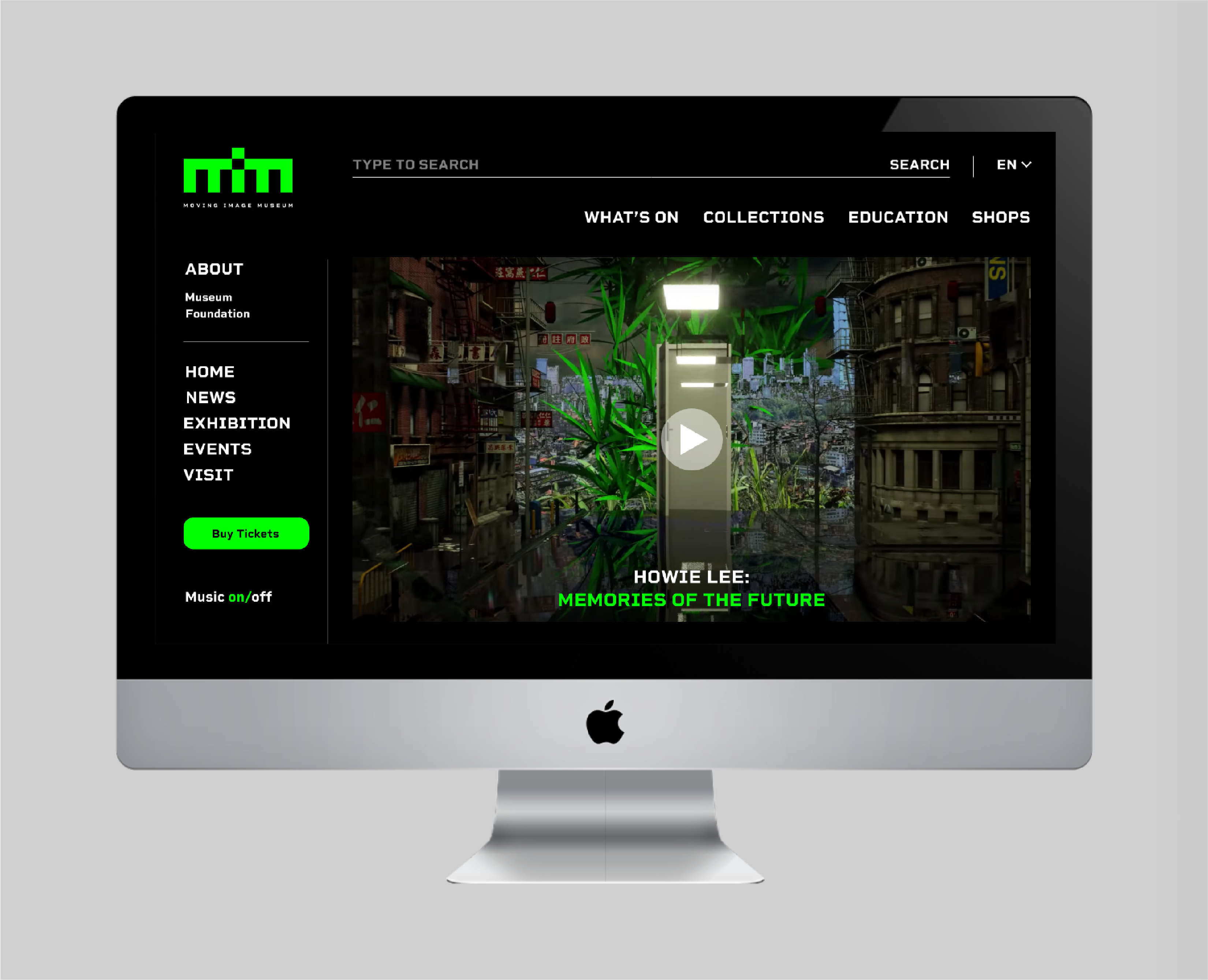
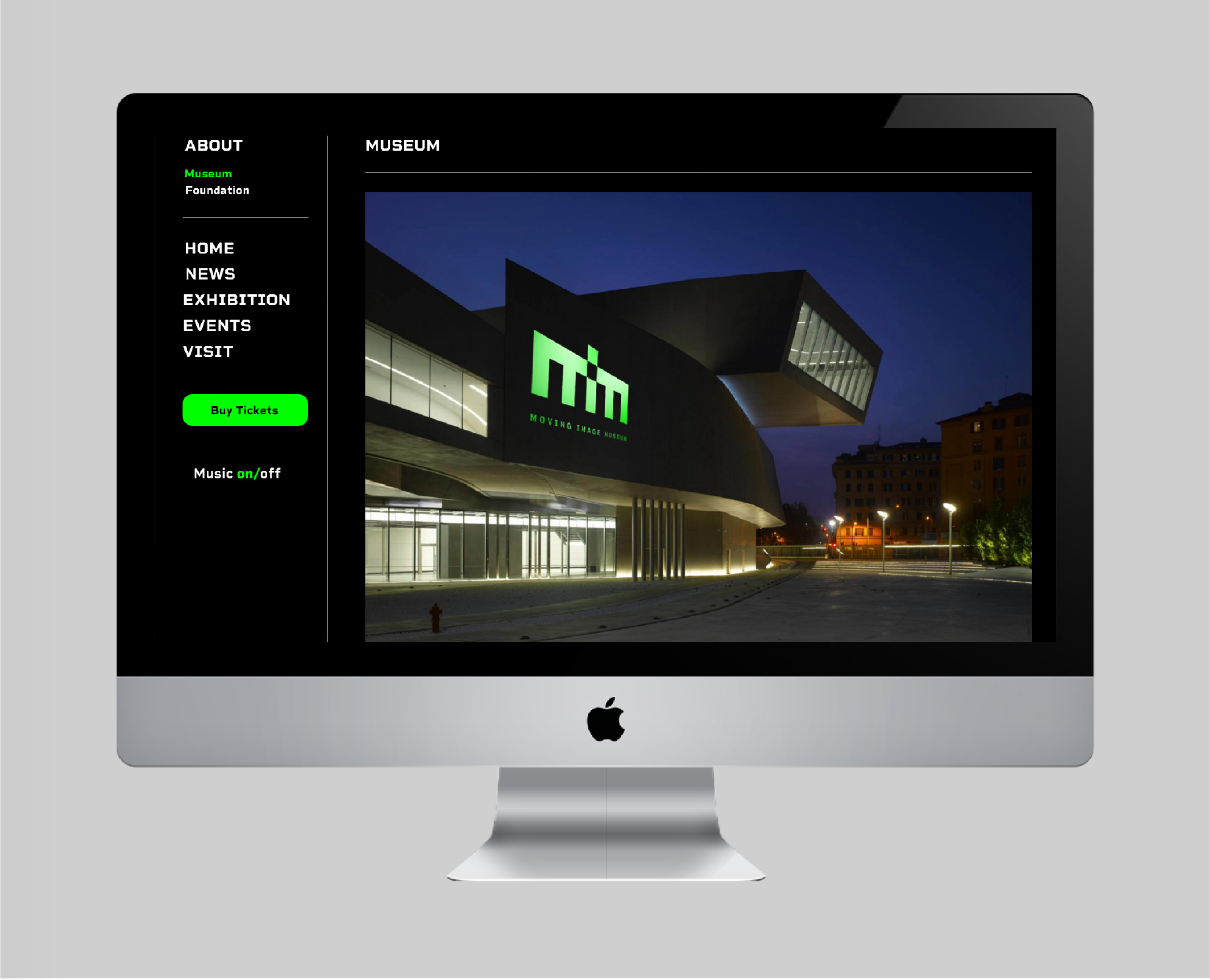
The logo design refers to the system of test card. We try to express “m, i, m” through geometric figures. The spacing between each rectangle is equal. The dot of i is obtained by cutting the rectangle below and trans lating it upward, so it is the same size as the negative space below.
The color of the logo, the dazzling pure lime green, is extracted from the test card. The green represents a strong sense of future and illusion.


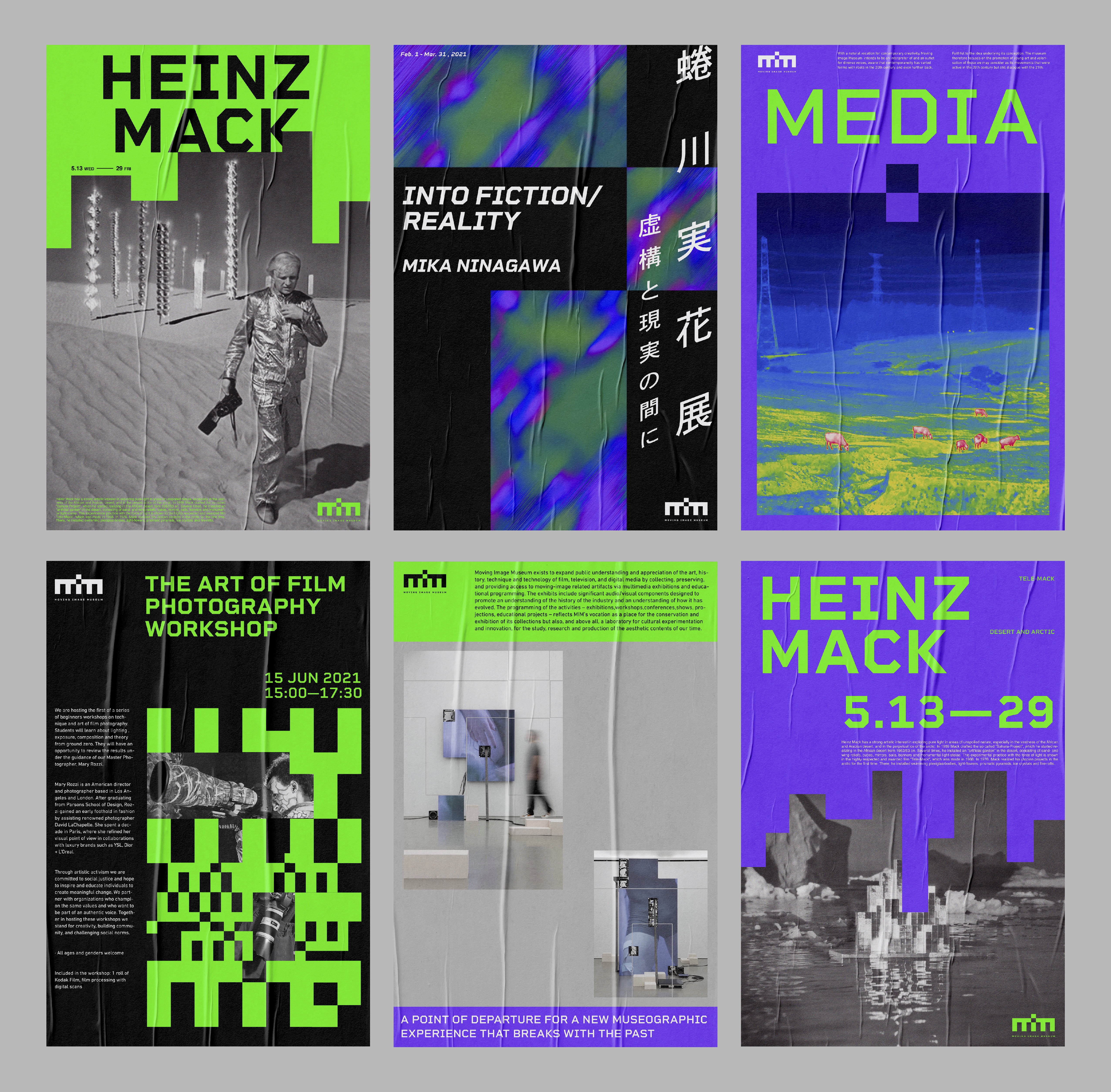
︎︎︎Poster series for upcoming events
︎︎︎
Collaterals


︎︎︎
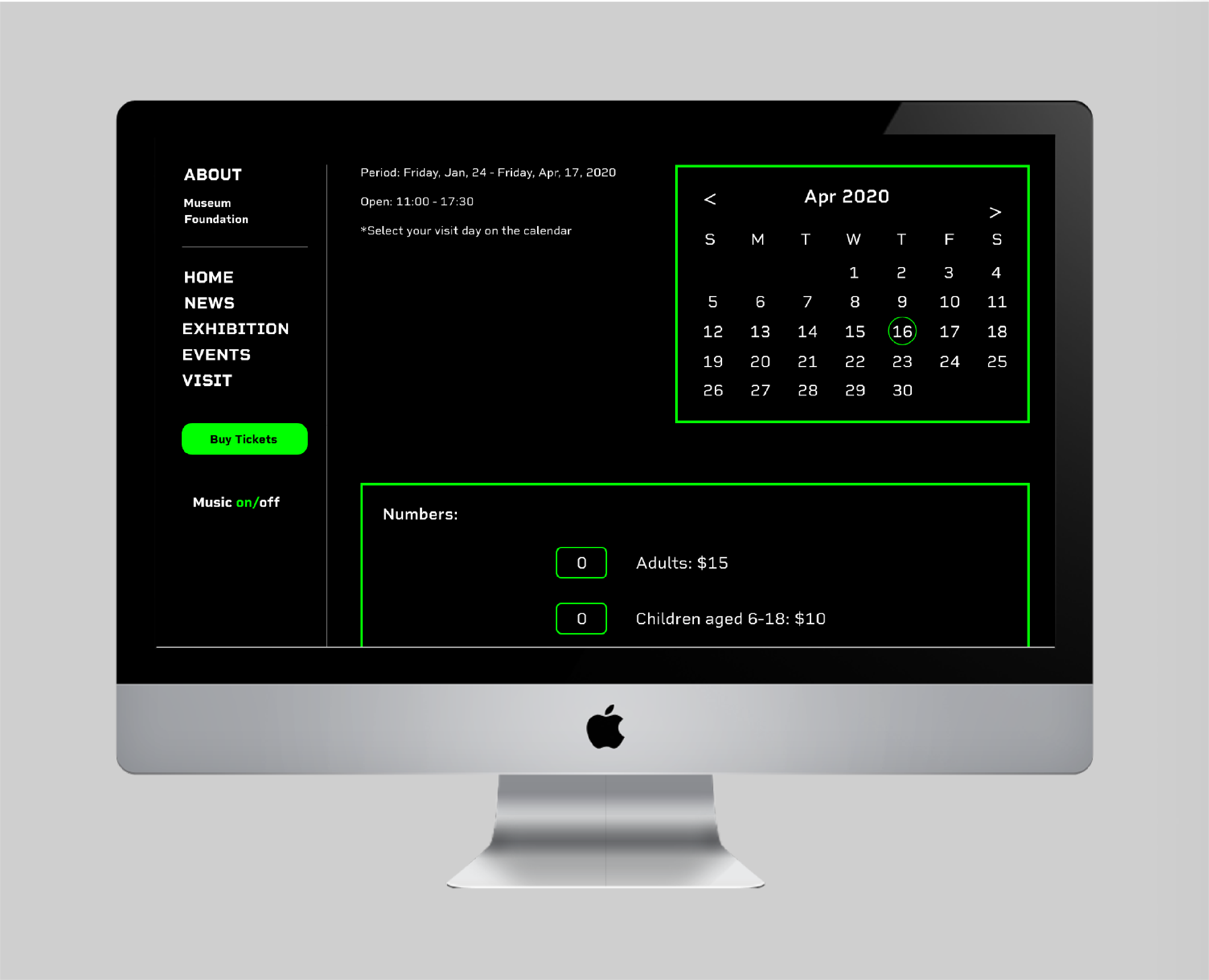
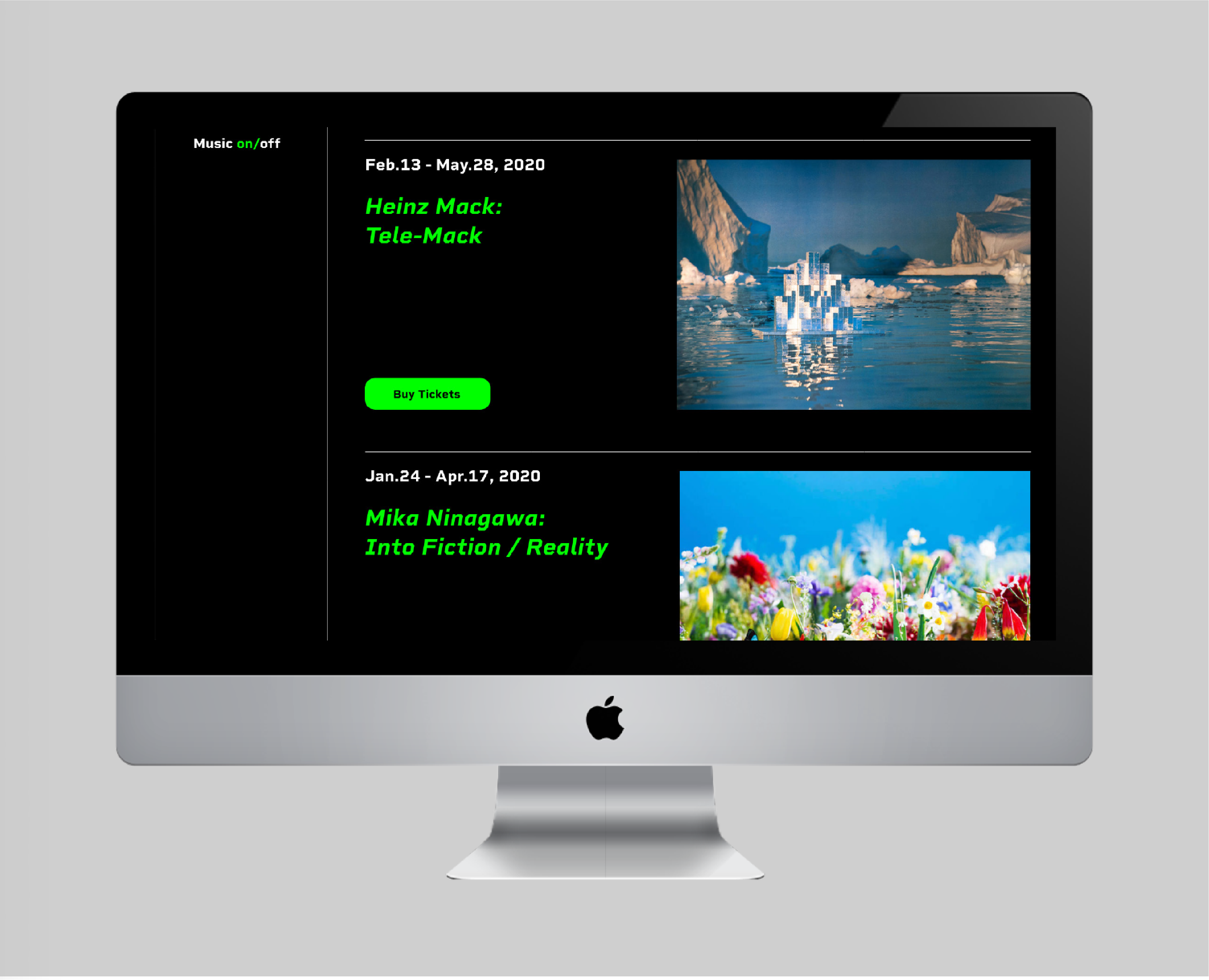
Website